benjysirois
Professional knob twiddler and sound anarchist
It looks great so far with the symbols Matt!
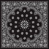
As for the extra symbols, I think it's going to be hard to find more to fill in the empty space so maybe make the bandana look something like this?

The little designs spaced out around in a circle could be the symbols and then you could fill the space with a cool abstract design. The four corners and the middle would be replaced with the symbols you already have. Hope this helps.
I agree! Otherwise the bandana seems a little dry and empty. Let's focus on picking the main highlights of course but once that is done it'd be excellent to fill out the pattern with some classic mandala/paisley bandana patterns. Looks great already though! In the transfer it'll look a little less polished looking and way more badass!
I have to say though...the star at the top looks a little hokey. Sorta reminds me of a tattoo from the dollar store. Just my thoughts! Everything looking great otherwise.


