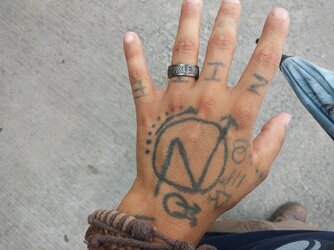
So with the permission of @ellilis , I've taken her bandanna design and modified it a bit. I'm almost done getting together all the silkscreening materials I need and I'll be printing and selling these here on StP! What I need from you is your opinions and ideas for this bandanna. Here's a rough draft:

As suggested by some, I've rotated the compass so the NSWE letters point downward when it's folded up around your neck. I've also removed the gears from her design and replaced them with squatter symbols and circle a's. I know the A's and N's are a little anarcho-squatter core, so if you have other ideas, let me know!. I've also taken out the sailboats and houses, but i'll most likely be putting the sailboats back in somehow. Lastly, I changed the railroad tracks to roads on the left and right for the rubber trampers")
I'd like to fill the black space with hobo symbols, but I haven't decided which ones yet. Here's a copy of @ellilis 's design for those who would like to compare:

I do like the gears, so maybe that's a better idea? Let me know! Ideally, I'd like for the finished product to be representative of everyone's input here on StP, and I'll probably be selling these for about 10 bucks.
A huge shout out to @ellilis for letting me borrow the majority of her design!
UPDATE 1: it isn't an official design, but i posted an update with various hobo symbols i'm thinking of putting on it if you want to give me your feedback, check it out here: https://squattheplanet.com/threads/the-stp-bandanna-project.20234/page-2#post-149806
UPDATE 2: new design with improved 'hand drawn' images in the corners, and some new hobo symbols thrown in. brought back the liquor bottles and sailboats. help me fill the rest with your ideas! Check it out: https://squattheplanet.com/threads/the-stp-bandanna-project.20234/page-3#post-149956
UPDATE 3: latest design is up, with added images of dumpsters, road dogs, and bindle sticks! we're getting pretty close to done, so let me know if you have any more ideas! https://squattheplanet.com/threads/the-stp-bandanna-project.20234/page-4#post-150576
UPDATE 4 (10/01/2014): turns out after printing a test sheet that all the symbols are waaaay to big! gotta resize everything. see the pics and details here: https://squattheplanet.com/threads/the-stp-bandanna-project.20234/page-6#post-153406
UPDATE 5 (11/2/2014): resized the corner symbols, shrunk the width of the tracks/road, and added 9 new symbols. need 12 more and we'll be done! check out the post here for full details: https://squattheplanet.com/your-projects/threads/the-stp-bandanna-project.20234/page-6#post-155545

As suggested by some, I've rotated the compass so the NSWE letters point downward when it's folded up around your neck. I've also removed the gears from her design and replaced them with squatter symbols and circle a's. I know the A's and N's are a little anarcho-squatter core, so if you have other ideas, let me know!. I've also taken out the sailboats and houses, but i'll most likely be putting the sailboats back in somehow. Lastly, I changed the railroad tracks to roads on the left and right for the rubber trampers
I'd like to fill the black space with hobo symbols, but I haven't decided which ones yet. Here's a copy of @ellilis 's design for those who would like to compare:
I do like the gears, so maybe that's a better idea? Let me know! Ideally, I'd like for the finished product to be representative of everyone's input here on StP, and I'll probably be selling these for about 10 bucks.
A huge shout out to @ellilis for letting me borrow the majority of her design!
UPDATE 1: it isn't an official design, but i posted an update with various hobo symbols i'm thinking of putting on it if you want to give me your feedback, check it out here: https://squattheplanet.com/threads/the-stp-bandanna-project.20234/page-2#post-149806
UPDATE 2: new design with improved 'hand drawn' images in the corners, and some new hobo symbols thrown in. brought back the liquor bottles and sailboats. help me fill the rest with your ideas! Check it out: https://squattheplanet.com/threads/the-stp-bandanna-project.20234/page-3#post-149956
UPDATE 3: latest design is up, with added images of dumpsters, road dogs, and bindle sticks! we're getting pretty close to done, so let me know if you have any more ideas! https://squattheplanet.com/threads/the-stp-bandanna-project.20234/page-4#post-150576
UPDATE 4 (10/01/2014): turns out after printing a test sheet that all the symbols are waaaay to big! gotta resize everything. see the pics and details here: https://squattheplanet.com/threads/the-stp-bandanna-project.20234/page-6#post-153406
UPDATE 5 (11/2/2014): resized the corner symbols, shrunk the width of the tracks/road, and added 9 new symbols. need 12 more and we'll be done! check out the post here for full details: https://squattheplanet.com/your-projects/threads/the-stp-bandanna-project.20234/page-6#post-155545
Attachments

Last edited: