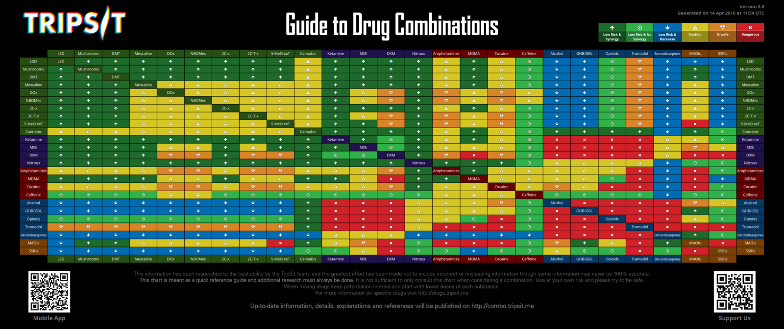
i'd say that chart is arbitrary at best, and dead wrong at worst. i say this having tried most of these combinations and having nearly died from some (of course I was taking way too much of both). drug interactions are way more complex than an infographic can convey and vary wildly from person to person. it's an alluring idea to have a handy colorful chart to refer to and plays perfectly into the psychonaut fantasy, but if I had seen something like this at 14 i might be dead.
I hear what you are saying but have you looked over the website? I'd like to know what you think of their more definite and detailed information. Some of the things seem slightly different. Such as the graph showing marijuana and most other drugs being okay to combine however on their website they state that marijuana and most other drugs probably shouldn't be combined despite likely not having adverse effects.
The graph doesn't actually state what the various factors do either as I've noticed. They should add a key or definitions. From the more verbose info on the website, it is generally just stated as the effects each combination has with other drugs in the average cross section. Combing one drug and another that are "Low Risk" when combined could mean that the effects of both are increased substantially but not in a harmful way. Think of exponential growth I suppose. 2 smaller amounts causing 2x the effects of equal doses of 1 thing individually. If that makes sense. I'd recommend following the disclaimer on the graph though, start low and do additional research.
I have no affiliation with whoever these people are, I'm just wondering if the info is good enough to maybe keep some people safe. Or maybe endanger some people if they stumble across it and use it.


