The StP Bandana Project

View attachment 17457

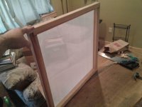
Small update, I got the frame finished today! My carpentry skills suck but it turned out pretty okay.

Tomorrow I'm going to start the emulsion process and burning the image into the screen.
 

Attachments

  • uploadfromtaptalk1411350266881.jpg
    uploadfromtaptalk1411350266881.jpg
    62.9 KB · Views: 580
okay, latest update!

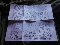
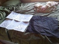
so... it's funny how things turn out when you actually print them out in real life as opposed to looking at it on a computer screen:

View attachment 17516

ignore the print quality, my printer was running out of ink.

View attachment 17515

so it seems that the bandanna fabric i got is actually 20 x 21 inches, and the design i've been working on is 22 x 22. also, as you can see, the current size of the circle n's and a's are waaaay too big. also, most of the other symbols are far too large as well.

so... i got a bit of reworking of the design to do. i gotta shrink the symbols, fill the space with more symbols and shrink everything slightly to fit the space of the bandanna fabric.

man, bandannas are a bitch! i'll have a new design up soon.
 

Attachments

  • IMG_20141001_165604.jpg
    IMG_20141001_165604.jpg
    2.8 MB · Views: 705
  • IMG_20141001_165610.jpg
    IMG_20141001_165610.jpg
    4 MB · Views: 774
Dang, did you hand cut all of that with an exacto knife? I do stencils and the hardest are always the ones with lots of tiny details like that.
 
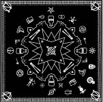
okay folks here's the latest update. like i stated before, when going to print the symbols and road/tracks were way too huge, so i shrunk them down to a more reasonable size. this created a lot of blank space for more symbols, so a spent a few hours searching for some and came up with a few which you can see in the image below. at this rate, it looks like i'll need another 12 images to fill in the rest, and then we'll be ready to print. so if you have suggestions, please let me know! it took me several hours to find the 9 new images i put in, so i could really use the help :)

now, as for printing... like i said before, i ordered about 50 black bandannas, but the quality wasn't that great, and they were cut weird (21 x 20 inches???) and so i decided to say fuck it, and eat the cost, cause the fabric just isn't up to spec. in the interest of time and trying to make these available as soon as possible, i've decided to pony up the $360 (+shipping) it'll take to have a real screen printer print this on proper fabric (and in the correct size :P).

so... as soon as i can get the design done, i'm sending it out to print. when it gets back i'll start taking orders. the more ideas you give me, the sooner the design will be finished!

So enough talk, here's the latest version:

View attachment 17742
 

Attachments

  • Bandkerchief_StPv2.jpg
    Bandkerchief_StPv2.jpg
    374.2 KB · Views: 1,866
Microcosm is owned and operated by rapists and because of that reason I think you should not include that symbol. Some other images that could be cool to put on could be little rucksacks or a wheelchair squat sign (I know there are already 2 squat related images but whatever) or perhaps a thumbs up (for the hitchhiker folk). Just my two cents
 
Microcosm is owned and operated by rapists and because of that reason I think you should not include that symbol. Some other images that could be cool to put on could be little rucksacks or a wheelchair squat sign (I know there are already 2 squat related images but whatever) or perhaps a thumbs up (for the hitchhiker folk). Just my two cents
Yeah, I don't know the whole story but I heard the main (former?) owner was accused of that... But what symbol are you referring to? I didn't realize I'd borrowed something from microcosm...
 
Microcosm is owned and operated by rapists and because of that reason I think you should not include that symbol. Some other images that could be cool to put on could be little rucksacks or a wheelchair squat sign (I know there are already 2 squat related images but whatever) or perhaps a thumbs up (for the hitchhiker folk). Just my two cents
Not to get too off subject here, but from what I understand of that situation it's pretty unfair to say the whole operation is owned by rapists because of the actions of one person. I'd be willing to bet that there are a lot of good, innocent people there who would resent that kind of blanket statement. Just sayin' :-\
 
idk about the four symbols on the right bud, they look real clean and don't fit really, plus man.....im a outlaw I cant wear a bunny. also two cents

hey, fuck you, man, goin' round sayin outlaws can't wear bunnies. what's your problem with bunnies?

okay folks here's the latest update. like i stated before, when going to print the symbols and road/tracks were way too huge, so i shrunk them down to a more reasonable size. this created a lot of blank space for more symbols, so a spent a few hours searching for some and came up with a few which you can see in the image below. at this rate, it looks like i'll need another 12 images to fill in the rest, and then we'll be ready to print. so if you have suggestions, please let me know! it took me several hours to find the 9 new images i put in, so i could really use the help :)

now, as for printing... like i said before, i ordered about 50 black bandannas, but the quality wasn't that great, and they were cut weird (21 x 20 inches???) and so i decided to say fuck it, and eat the cost, cause the fabric just isn't up to spec. in the interest of time and trying to make these available as soon as possible, i've decided to pony up the $360 (+shipping) it'll take to have a real screen printer print this on proper fabric (and in the correct size :p).

so... as soon as i can get the design done, i'm sending it out to print. when it gets back i'll start taking orders. the more ideas you give me, the sooner the design will be finished!

So enough talk, here's the latest version:

View attachment 17742
Although on the other hand that Guy Fawkes mask is a 100% no go, it looks bad on the bandana, and the mask isn't really a great symbol as it's been used by a group with pretty racist/sexist/homophobic tendencies from a website populated mostly by straight white males.
 
It looks great so far with the symbols Matt!

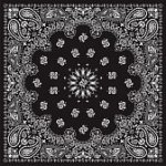
As for the extra symbols, I think it's going to be hard to find more to fill in the empty space so maybe make the bandana look something like this?

View attachment 20236

The little designs spaced out around in a circle could be the symbols and then you could fill the space with a cool abstract design. The four corners and the middle would be replaced with the symbols you already have. Hope this helps.
 

Attachments

  • 657564-black-bandana-with-white-ornaments--no-transparency-and-gradients-used-in-the-vector-file.jpg
    657564-black-bandana-with-white-ornaments--no-transparency-and-gradients-used-in-the-vector-file.jpg
    18.9 KB · Views: 827
  • Like
Reactions: Xan
I think the finalized design looks kickass. So glad to see this project is finally coming to fruition. I'll definitely be ordering one.
 
Against the Guy Fawkes mask.
Displeased with the decline of Catholicism in the UK, he decided to blow up parliament.

Do we really want to promote religious extremism?
 
Last edited:
Against the Guy Fawkes mask.
Pissed with the decline of Catholicism in the UK, he decided the solution was to blow up parliament.
Do we really want to promote religious extremism?
While I understand the historical significance of Guy Fawkes, I feel like the modern usage of the mask has more to do with subverting unjust governments and (more specifically) is a reference to Anonymous and other groups of activists fighting for social justice.
 
Looks good could use a thumb for the hitchhikers and a freight train on the tracks would be cool. How do I order one and how much does it and when can I order one?
 
While I understand the historical significance of Guy Fawkes, I feel like the modern usage of the mask has more to do with subverting unjust governments and (more specifically) is a reference to Anonymous and other groups of activists fighting for social justice.

yep. what he said.

The little designs spaced out around in a circle could be the symbols and then you could fill the space with a cool abstract design. The four corners and the middle would be replaced with the symbols you already have. Hope this helps.

I'll play around and see if I can come up with something. My Illustrator skills are limited :p

Love the bolt cutter addition :)

thanks, i was hoping you'd like that :)

Looks good could use a thumb for the hitchhikers

ok, i think i got a good one in there now. i'm working on the train.

How do I order one and how much does it and when can I order i'one?

i'm hoping to finish the design in the next 2-3 days. i'm guessing perhaps about 2 weeks after that i'll have the finished product in hand ready to sell. so hopefully, middle of november they'll be ready?
 
Back
Top